1. What do you think the genre of the magazine is?
2.Do you think that the colours of the magazine are consistent throughout?
4.What do you think of the central image of the magazine?
5.Would you buy the next issure of Wired?
6.What are your likes and dislikes of this magazine?
7.Does the magazine offer a good variety of content?
8.Is the colour scheme effective?
9.Do you think the price of the magazine is acceptable?
10.Does the double page spread look affective?
11.What existing magazine does it remind you of?
12.Are you happy with the layout of the magazne?
13.Is there a unique font?
I handed 15 questionaires out to a variety of people so I had a good choice of answers. I then made all the answers into bar charts each question.

As you can tell that 11 people voted saying that they thought my music magazine were Rock, they were right.

Here is if they would happly buy the next issue of Wired. 15 of them said yes and only 3 said maybe.
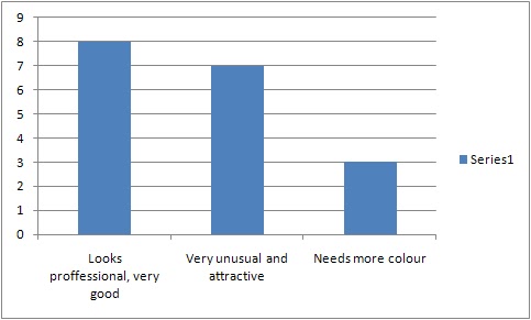
This is what they thought of my magazine and what i should do to improve on it.

This question was if they thought my colours consisted through out my magazine.


This question was to see if they think the price of magazine is acceptable.

No comments:
Post a Comment