
Friday 4 March 2011


Evaluation
1.In what ways does your media product use, develop or challenge forms or conventions of real media products?


Here is my own contents page that I made on QuarkXPress


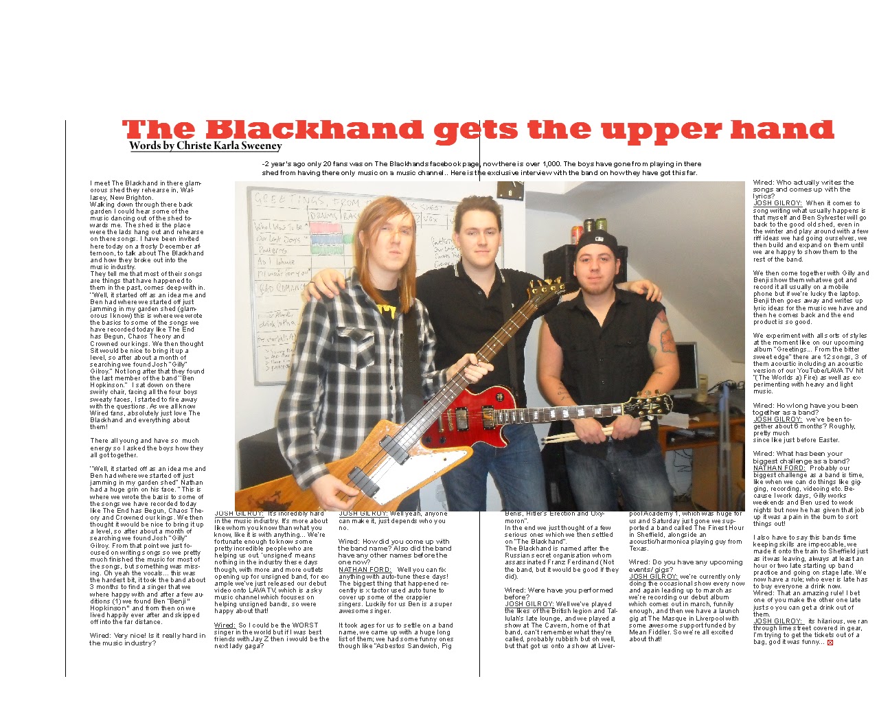
Here is my double page spread that I made.
 Both double page spread stick to simple layout, and is very straight-forward and not complicated. They both use a headline at the top middle page and they also use the main image in the middle of the page
They also both use a stand first
Both have equal colums
Both have 6 colums, 3 on each page
2. How does your media product represent particular social groups?
The double page spread article, represents The Blackhand which therefore represents people who like them and that is a large social group. Therefore my media product represents the particular social groups as positive.
3.What kind of media instuation might distribute your media product and why?
http://www.scrapblog.com/viewer/viewer.aspx?sbid=2906780
This is my own magazine that I created


This is the magazine that I am basing my music magazine on.
My magazine challenges the form of the conventions of real media products as I have followed the codes and conventions of music magazines. I found a magazine that I liked and I liked the layout of it so I based my magazine onto it. Both magazine follow the codes and conventions.
The orange circle is a puff and inside the orange cirlce I have put an exclusive object 'Free CD'. It makes the audience want to buy the magazine as its a puff (brings something extra to the magazine) when seeing this the readers wants the magazine so then they will buy it. I have done this and also used the same colour used here.
The Title is always situated in the top left hand corner of the page where the audience begins to read. They normally have one main image, either a medium close up of usually a band or singer or a long shot of them - the image slightly covers title, however the title never covering main image.
Also have the price on the bottom left or right hand side, normally by the bar code. Its small to and not large. Also the colours have to be consistent throughout, there cant be random colours doted everywere on the page otherwise it wouldnt flow and look proffesional. Look very cheap.
Both front covers are 'busy' and look interesting with a variety of context
Both front covers also have a tag line and is placed undernearth the main title of the magazine.
This is the contents page that i based my own contents page on
Here is my own contents page that I made on QuarkXPress

On your front cover of the magazine and contents, the colours have to be consistent throughout, so that why I have used the same colours in my contents that were used in front cover.
Both contents have 2 colums to make it easy to follow
Both contents have page number on the images used on the page
Both of the contents pages have the date and issue number of the contents on the top of the page
Both have used more than 2 images
Here is the double page spread that i based my own one on

Here is my double page spread that I made.

They also both use a stand first
Both have equal colums
Both have 6 colums, 3 on each page
The double page spread article, represents The Blackhand which therefore represents people who like them and that is a large social group. Therefore my media product represents the particular social groups as positive.
3.What kind of media instuation might distribute your media product and why?
http://www.scrapblog.com/viewer/viewer.aspx?sbid=2906780
Audience profile- Question 4 on the evaluation

Name: alex jones
Age: 18
Occupation: Works in Morrisons
Hair Colour: brown
Eye Colour: Green
Favourite Music: Lady Gaga, Katy perry, Ellie goulding
Buys her clothes at: Topshop, new look, miss selfridge
What she does in her spare time: goes shopping, gets her hair done, spends time with friends
Audience profile- Question 4 on the evaluation
Name: nick west
Age: 20
Occupation: Student
Hair Colour: brown
Eye Colour: Green
Favourite Music: eminem, plan B, Jessy J
Buys her clothes at: Topman, JJB, burton
What he does in his spare time: Go to gigs, watch the football, go to the pub with his friends
Audience Profile

Name: Rebecca grape
Age: 17
Occupation: Student but works in new look
Hair Colour: Browny/red
Eye Colour: brown
Favourite Music:Vampire Weekend, mumford and sone and the wombats
Buys her clothes at: Topshop, primark
What she does in her spare time: goes to gigs, studies towards herA-levels, goes out with friends and enjoys spending time with the family.
5. How did you attract/address your audience?

I tryed to attract my audience by using a young female on the front cover as my central image. This attract young people as she s young herself and also she is a good looking girl so this would attract boys you have a second glance at the magazine. I also used dark heavy makeup on her and added a black leather jacket to show connotations of 'Rock' Therefor by them getting drawn in by my main image.I used a good variety of coverlines on the front cover I chose artists/bands that I knew the audience would like but I still made sure it fitted in with my genre. I have done this so the audience would be interested in buyin the magazine.
The use of colour is another way I tried to attract my audience with; I have used a consistent colour scheme which my audience chose during the questionnaire. I changed some colours when I handed my questionnaires out as then this shows that I have listened to them and not just looked past it and kept it there.

I used constent colours scheme throught out it, so I made sure had the same colours on the front cover aswell as the contents. I have used a variety of images. This would attract the audience as they have a visual image to the gig of their favourite bands.
Once again I have used the same colours throughtout my magazine, as when doing my questionnaire thats what all my auidence liked the best out of it all. I have used the main image in the middle of the page and large so it stands out straight away and grabs your attention. Also the guitters the boys are holding connote music.
6. What have you learnt about technologies frm the process of constructing this product?
At the start of the course, we was told that we was not aloud to use copied photos so all my photographs were taken by myself. therefore every picture we used came from our own creative ideas.
I have also used new tools from software such as Adobe Photoshop and QuarkWPress
I have discovered new ways to use mise-en-scene effectively so that the image reflects the subject/text.
I have learnt how to use a still camera so that i capture everything in an image that i need to get the outcome i desire.
7.Looking back at your preliminary task, what do you feel you have learnt in the progression from it to the full product?
Preliminary Task

Actual Task
Since when i started my first premineraly task the school magazine, I didnt know what I was doing when i first started as all the software was new to me and it was the first time I had used it.
Target audience feedback
For my magazine, I had to get auidence feedback from my audience. I wrote a questionnair and this is what the questions were:
1. What do you think the genre of the magazine is?
2.Do you think that the colours of the magazine are consistent throughout?
4.What do you think of the central image of the magazine?
5.Would you buy the next issure of Wired?
6.What are your likes and dislikes of this magazine?
7.Does the magazine offer a good variety of content?
8.Is the colour scheme effective?
9.Do you think the price of the magazine is acceptable?
10.Does the double page spread look affective?
11.What existing magazine does it remind you of?
12.Are you happy with the layout of the magazne?
13.Is there a unique font?
I handed 15 questionaires out to a variety of people so I had a good choice of answers. I then made all the answers into bar charts each question.


 Here is the question, is there a unique font used? A unique font was used however 2 people said there wasnt.
 This question was if they liked the layout of the magazine or not? They were all happy with it.
 This question was 'What existing magazine does it remind you of?' Most of them said that it reminds them of Record Collecter the most, and that is what I based my magazine on

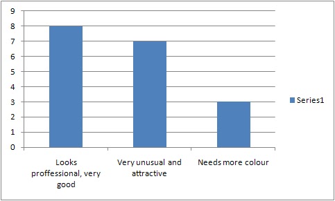
 This question was to see if they thought my double page spread was affective or not, surprisingly most people said no.
1. What do you think the genre of the magazine is?
2.Do you think that the colours of the magazine are consistent throughout?
4.What do you think of the central image of the magazine?
5.Would you buy the next issure of Wired?
6.What are your likes and dislikes of this magazine?
7.Does the magazine offer a good variety of content?
8.Is the colour scheme effective?
9.Do you think the price of the magazine is acceptable?
10.Does the double page spread look affective?
11.What existing magazine does it remind you of?
12.Are you happy with the layout of the magazne?
13.Is there a unique font?
I handed 15 questionaires out to a variety of people so I had a good choice of answers. I then made all the answers into bar charts each question.

As you can tell that 11 people voted saying that they thought my music magazine were Rock, they were right.

Here is if they would happly buy the next issue of Wired. 15 of them said yes and only 3 said maybe.
This is what they thought of my magazine and what i should do to improve on it.

This question was if they thought my colours consisted through out my magazine.


This question was to see if they think the price of magazine is acceptable.

Subscribe to:
Posts (Atom)